Project Structure
I focused on integrating AI support into the workflow. The
goal was to make it feel natural and non-intrusive. To do this, I examined how users
interact with systems that feature AI tools.
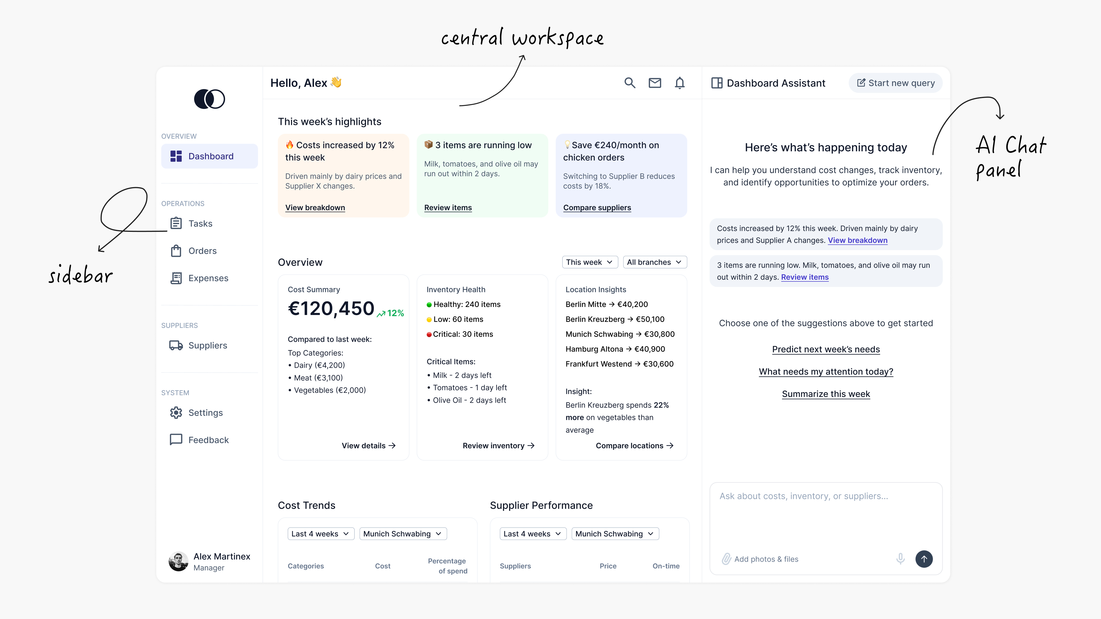
Based on this approach, I structured the interface into three
main areas:
- A left sidebar for navigation
- A central workspace for core tasks and
data
- A right-side AI panel for assistance
and quick actions
Dashboard Design
When designing the dashboard, I wanted users to quickly understand
what is happening and what needs their attention.
Managers and owners can access overall performance and
branch-level insights. This helps them monitor the entire business or zoom in on a
specific location as needed.
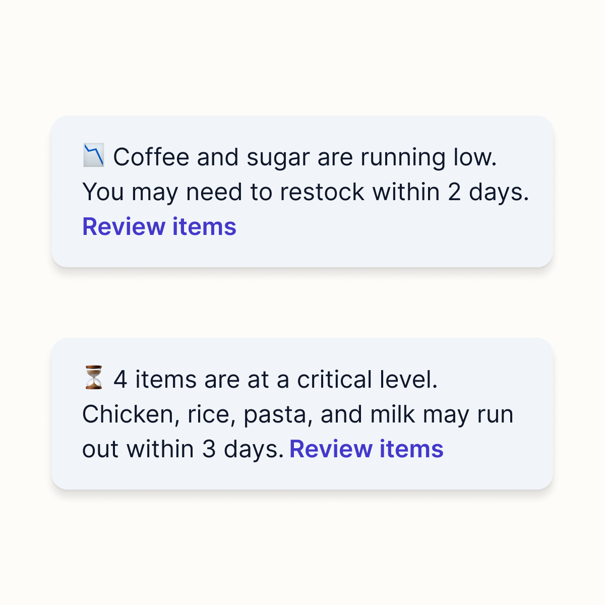
Instead of showing too much data, I focused on highlighting the
most important points first. Users can see things like cost increases, low inventory, or
saving opportunities.
On the dashboard, the assistant acts as a quick guide for the day.
It highlights important updates like rising costs or low stock and offers simple prompts
to explore further. Users can quickly understand what is
happening and decide what to do next.
For example, an owner can ask about the status of a specific
purchase, such as checking how a strawberry order is progressing. The assistant can
summarise the current situation. It can highlight delays and bottlenecks and explain
where issues are occurring.
Users can use quick prompts to find out why prices are going up.
They can see which factors are increasing costs and look at AI-recommended suppliers
with better pricing.
This helps users move from questions to clear actions more
quickly.
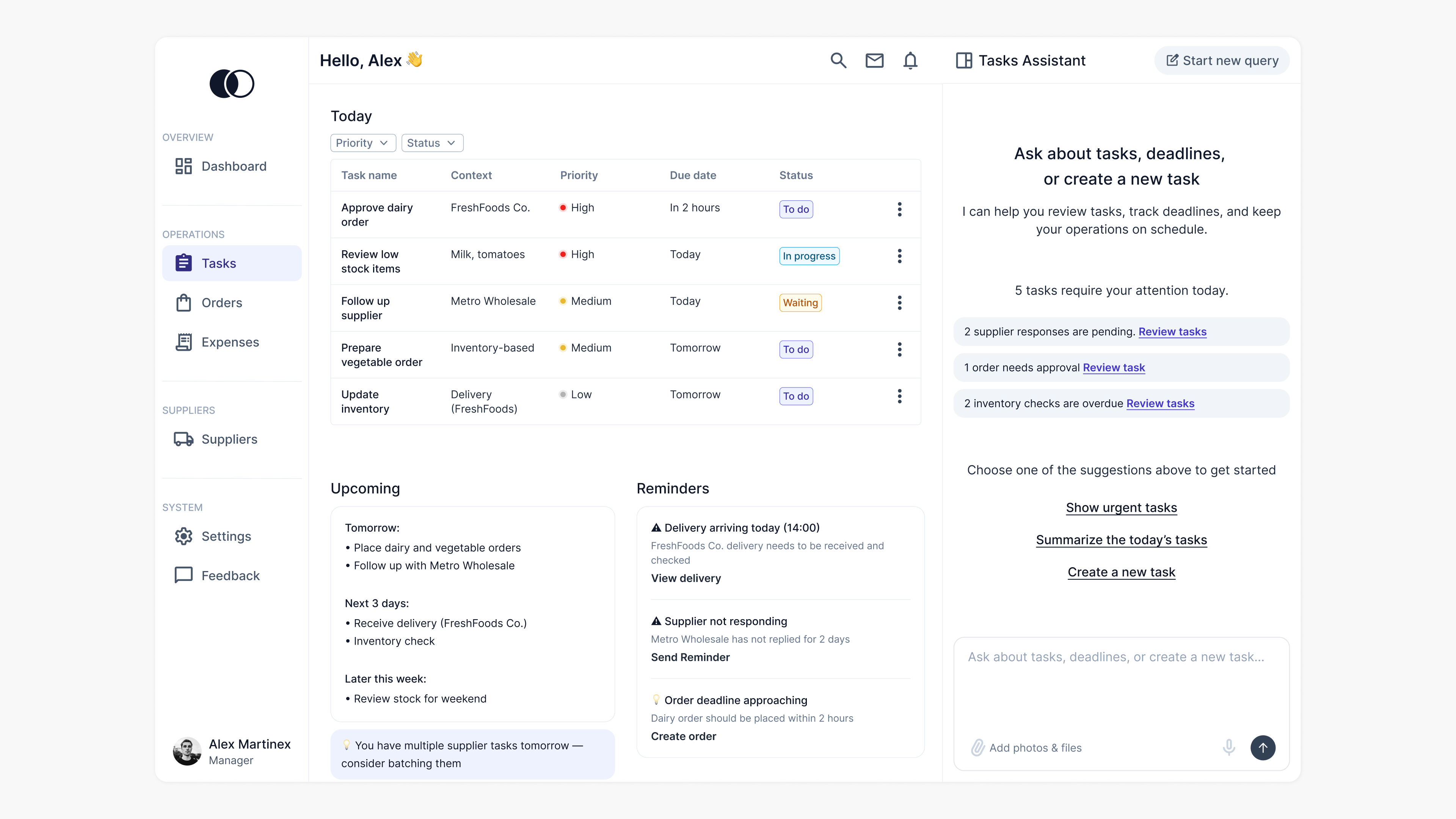
Tasks Page Design
The tasks page helps managers focus on what needs to be done
today. Tasks are grouped by priority, making it easy to see what is urgent and what
comes next.
Instead of a full calendar, a simple upcoming view shows the next
few days, keeping short-term planning clear and lightweight. Reminders show important
events, such as deliveries and delays. This helps users notice issues quickly.
The assistant helps by showing tasks that need attention. It
offers quick actions, like reviewing urgent tasks or creating a new one. This way, users
can act faster without extra steps.
Orders Page Design
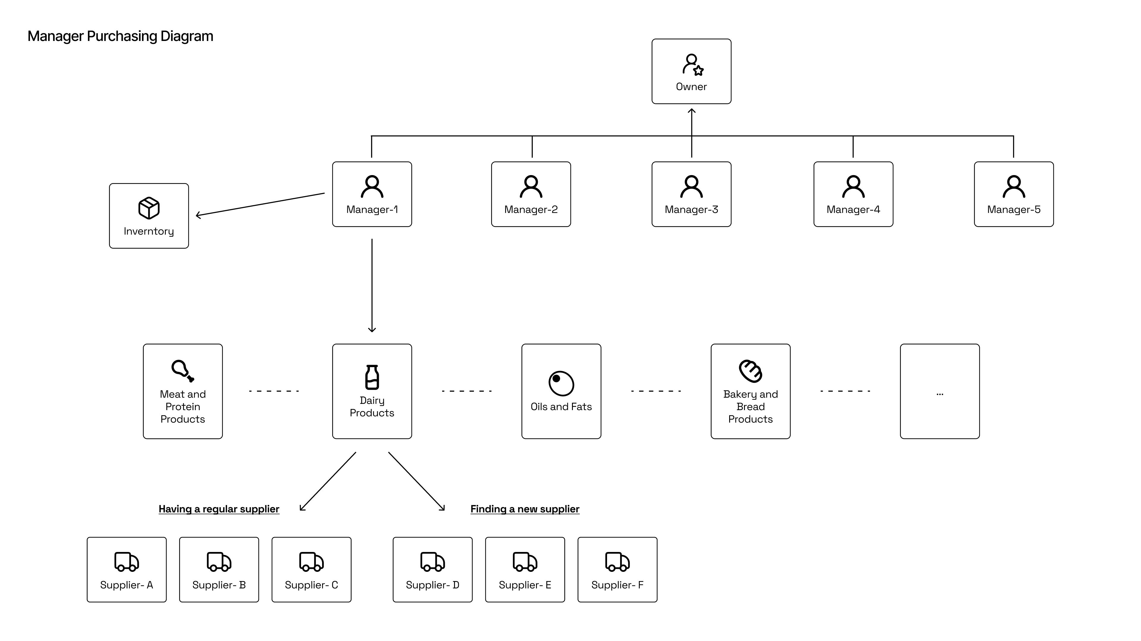
The most critical part of the experience is how supplier data is
handled and turned into decisions.
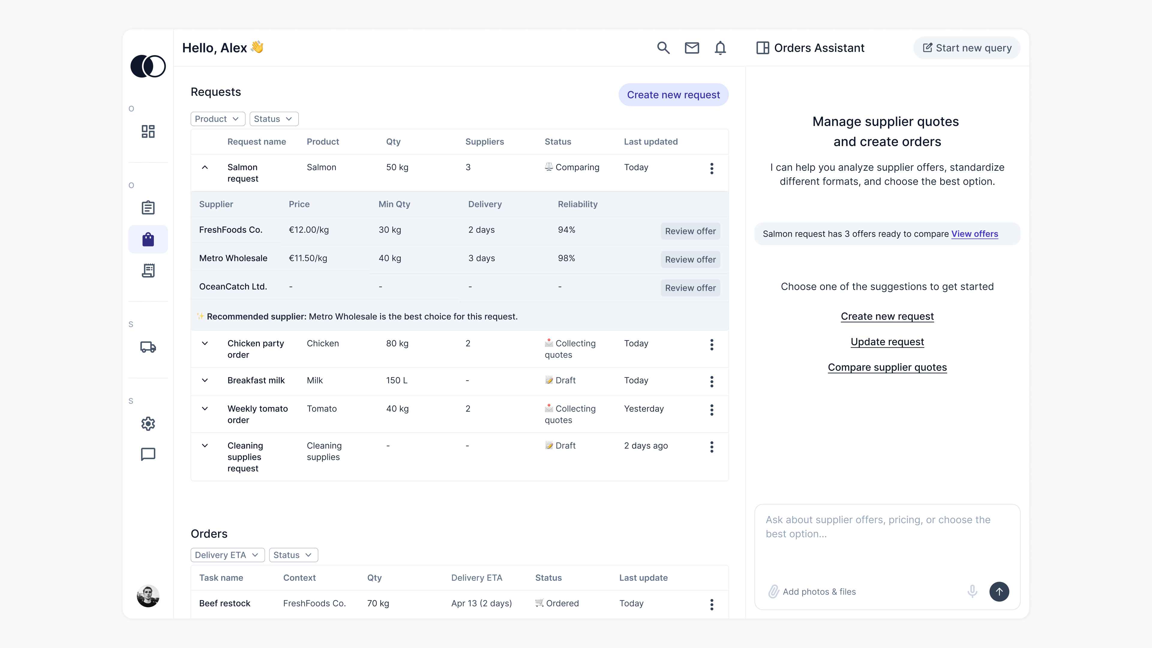
Structuring the Order Workflow
The ordering process can feel complex, especially when managing
multiple suppliers and offers. To simplify this, I structured the experience into two
main parts: requests and orders.
Requests are where everything starts. Users define what they need,
add suppliers, and collect quotes. As offers come in, they appear in a table. Users can
expand the table to see more details and compare offers easily.
Orders come after a decision is made. This is where users
communicate with suppliers, track deliveries, and follow up when needed.
To keep things simple, I designed a single space for managing
requests. This view shows all important information in one place. It includes request
details, selected suppliers, incoming offers, and their comparison.
This reduces the need to switch between pages and keeps users
focused. Everything is in one place, and AI helps in the background by organizing the
data and supporting the process.
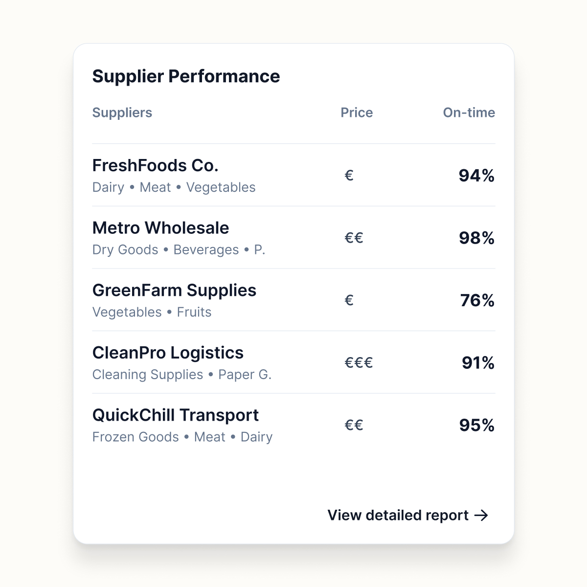
Making Supplier Data Easier to Understand
One of the biggest challenges in procurement is understanding
offers.
In reality, quotes come in
inconsistent formats. Some suppliers
send PDFs, others share
images or write details in emails or messages. This makes the process
fragmented and
hard to manage. Managers have to read each file, extract the information, and compare it
manually. It takes time and increases the risk of missing important details.
When designing this experience, I
focused on reducing this
complexity and removing manual work from the process.
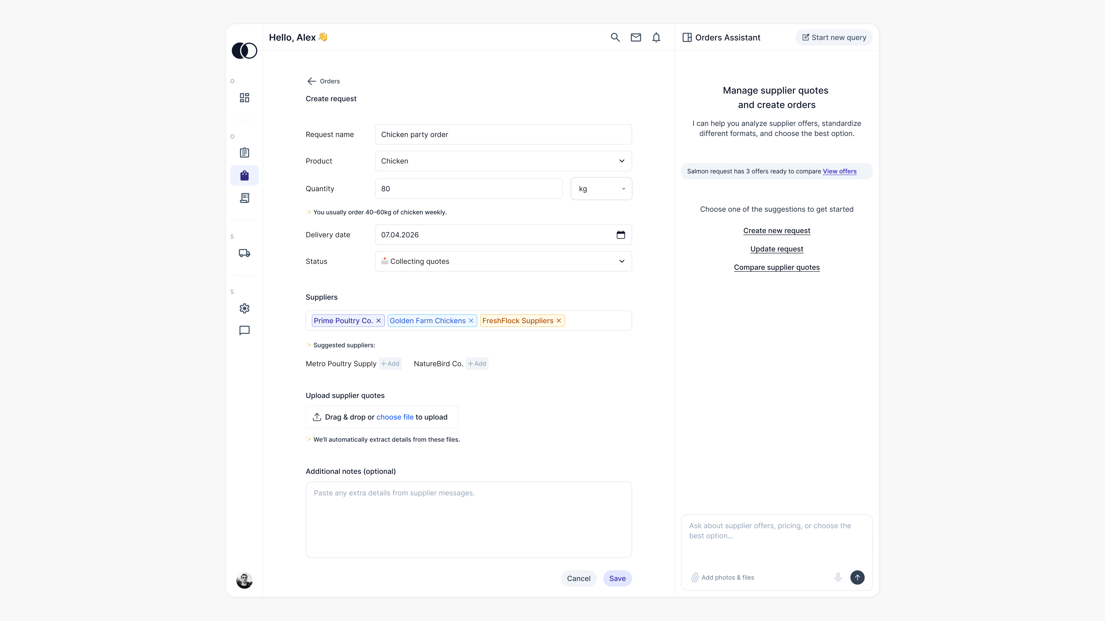
Instead of expecting users to organize the data themselves, I
allowed them to upload supplier documents in any format. The system uses AI models like
OCR and LLMs to extract key information. It turns this
data into a structured table for
easy review and comparison.
My goal was to simplify how users work with supplier data and make
the comparison process faster and more reliable.
From Request to Order
Every order goes through a process, from defining a need to
comparing options and making a decision.
This flow is reflected in the experience as:
Define → Collect → Compare → Decide
Define
Users start by defining what they need. They enter key
details such as product, quantity, and delivery date, and select suppliers. This
step is intentionally simple to help users move forward quickly.
Collect
Users collect supplier offers. The system handles data
processing automatically in the background. All relevant information is brought
together in one place.
Compare
As data becomes available, users can compare options in a
structured table. Prices, delivery times, and conditions are clearly presented.
AI highlights the best option and helps users understand the differences.
Decide
Users make a decision and take action. They can review a
specific offer, check supplier history, and either create an order or contact
the supplier. AI also assists with communication, such as drafting messages.
AI as a Decision Partner
AI is integrated into the ordering experience to reduce manual
effort and support users in making better decisions.
- Transforming unstructured inputs into usable data
Supplier documents are processed automatically. Key details are extracted and turned
into a structured format. This way, users do not need to organise the information
manually.
- Making comparisons easier to understand
Users can identify key differences between suppliers, such as price, delivery, and
reliability. This helps them evaluate their options quickly.
- Supporting communication when needed
AI helps users write messages. It suggests negotiation points and simplifies supplier
interactions.
AI is integrated into the ordering experience to reduce manual
effort and support users in making better decisions.