trueyogi hero image

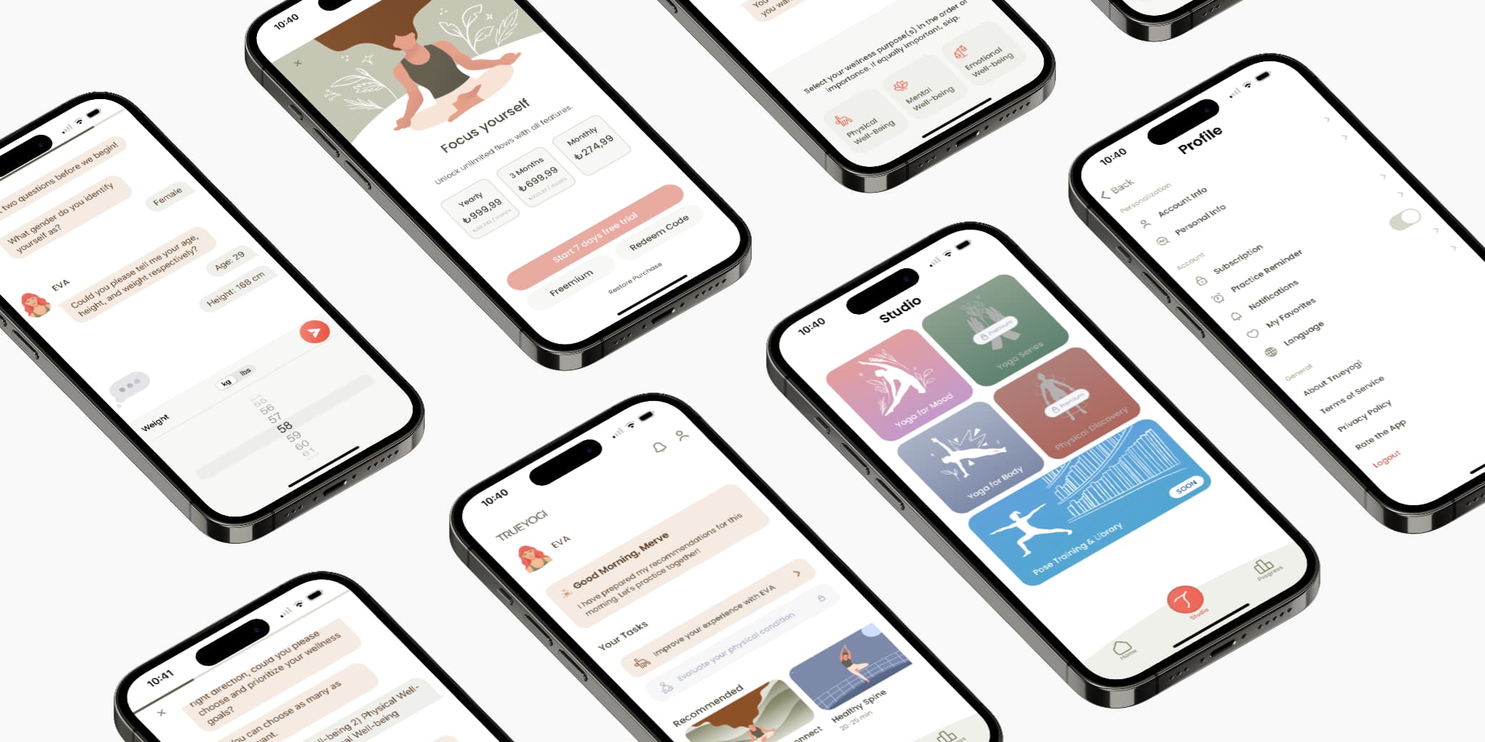
Smart Yoga Application

Timeline
2022 - 2023
Client
Trueyogi
Platform
Mobile application for iOS
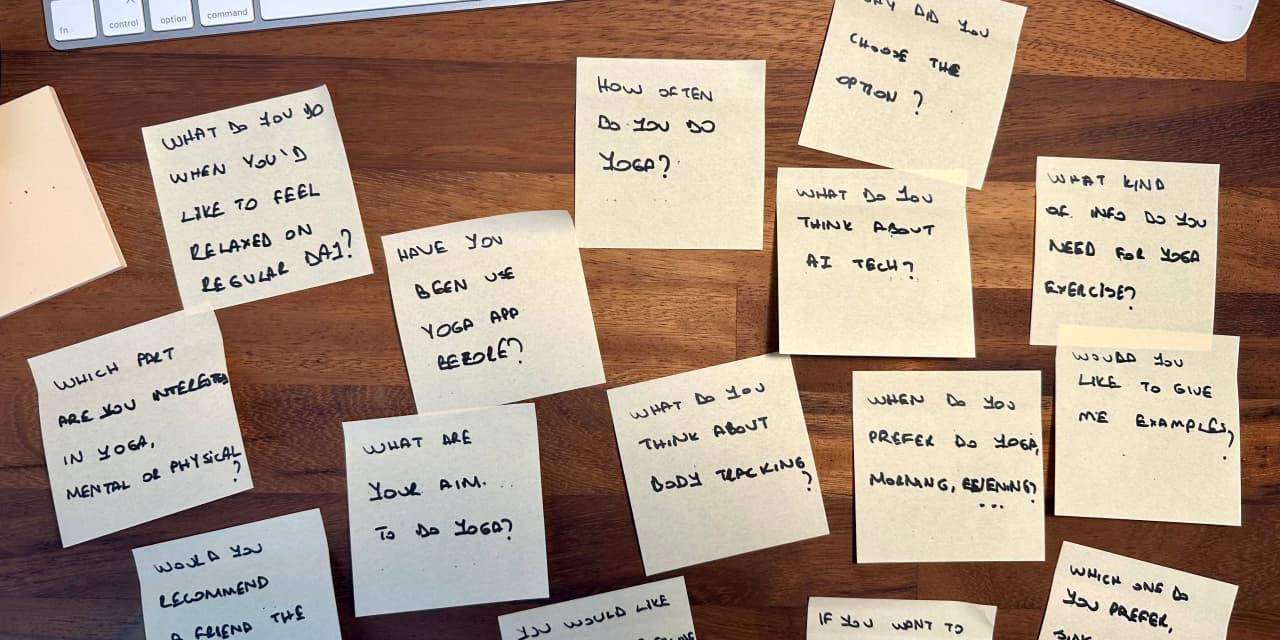
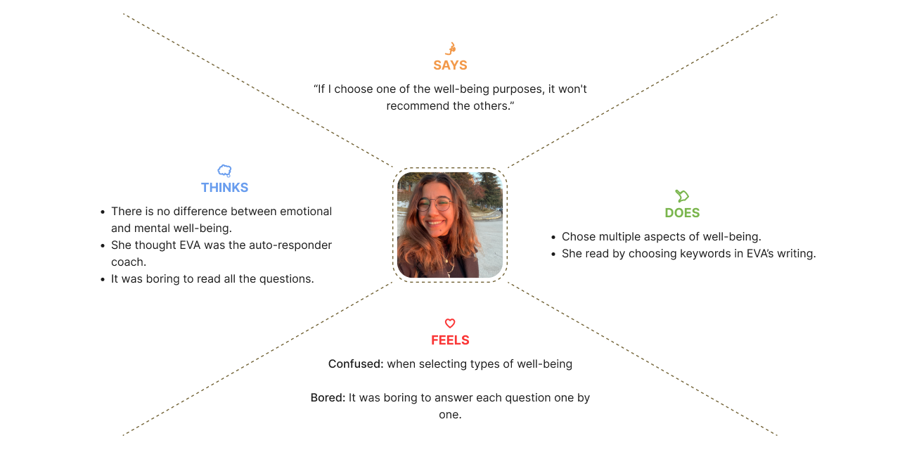
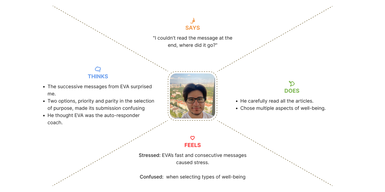
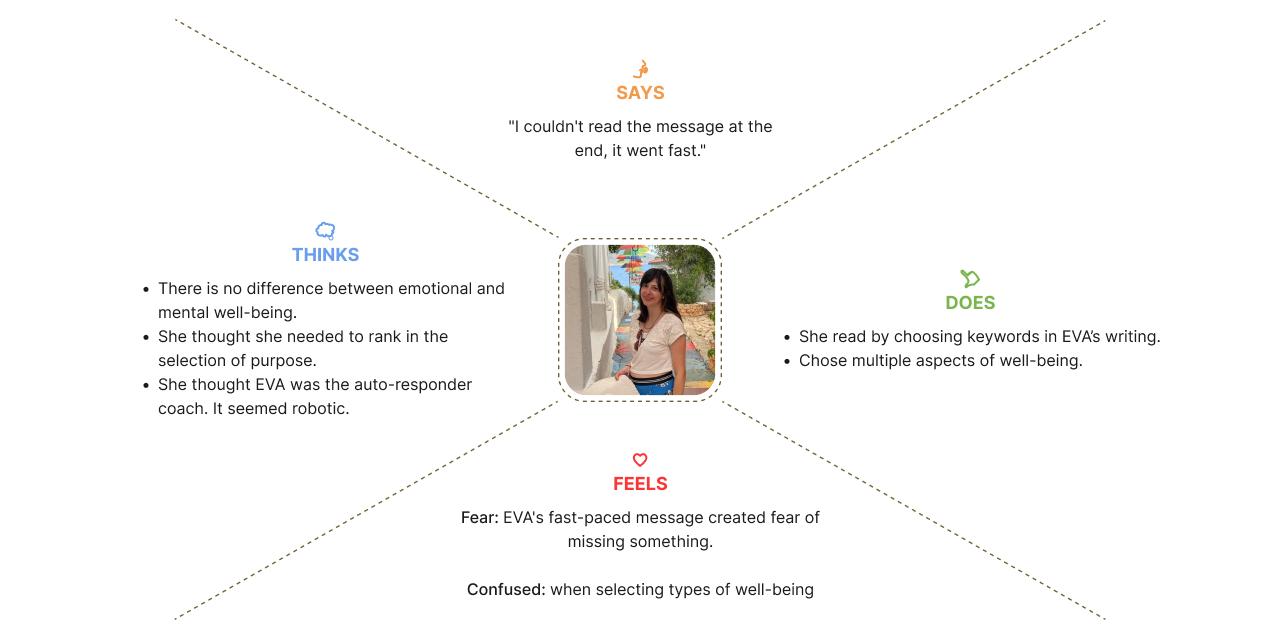
My Role
UI/UX Designer – handled research, testing, prototyping, and UI design
Understanding the Problem
Many people struggle to perform yoga poses correctly when practicing at home. Trueyogi is a wellness app that uses the phone camera to analyze users’ body movements and provide real-time guidance to help them improve.
I joined the Trueyogi team after the beta launch, tasked with identifying user challenges and refreshing the product experience. To better understand user needs, I conducted interviews with existing users.
Listening to First Impressions
I prepared and ran user interviews to understand how first-time users experience onboarding and the start of a yoga session.
Through user interviews focused on signup and first session setup, I identified key friction points and used Empathy Maps to visualize user needs and pain points.
Slide 1
Slide 2
Slide 3
Slide 4
Slide 5
The sessions revealed two key issues:

Robotic and Unclear Language

Users found the app’s language overly technical and impersonal, especially during onboarding. The use of abstract terms made it hard to understand questions and reduced trust in the experience from the very beginning.

Misleading Health Settings

Beginner users misunderstood the “target area” selection. Instead of indicating discomfort or physical limitations, they chose the body parts they wanted to train. This led to mismatched recommendations and confusion about the app’s purpose.

Learning from the Competition
To identify what works and what doesn’t in similar products, I studied leading yoga and fitness apps in the market.
I focused on direct competitors like Zenia, Downdog, and Daily Yoga, and also included Freeletics as an indirect player due to its personalization and coaching features.
My observations on our competitors:
• Apps typically ask for personal info upfront, before login or sign-up.
• They guide users using simple, encouraging language rather than technical terms.
• Onboarding questions are framed around goals and preferences, not just body parts or limitations.
• Recommendations feel tailored, often adjusting based on fitness level, mood, or target areas.
What this meant for us
This analysis helped me spot where Trueyogi could stand out with clearer communication, a friendlier tone, and more intuitive onboarding aligned with users’ actual goals.
Design Solutions

Simplifying the app’s language

The original product language relied on complex and abstract terms that confused users. Many also described EVA’s responses as robotic and impersonal.

To improve clarity and user engagement, we simplified the language throughout the app. EVA was given a more friendly and conversational tone, making her feel more attentive and responsive to user input.

Adding health condition options

User feedback and expert trainer input revealed that collecting health information before sessions could significantly improve the experience.

As a result, we introduced an option for users to indicate their health conditions when choosing yoga exercises. This enables the app to provide AI-powered, personalized recommendations tailored to each user’s needs.

AI-powered yoga suggestions

Users can create personalized physical and mental workouts or explore curated exercises categorized by body focus and mood.

This enhancement aims to improve user engagement by offering more flexible and personalized exercise options, powered by AI.

Final Design
trueyogi final design trueyogi final design trueyogi final design