Visual language has been a way for people to express
themselves and connect with their surroundings for centuries. Today, this language
has quietly become an integral part of our everyday lives: while walking down the
street, messaging a friend, or even operating a washing machine, pictograms, icons,
and emojis constantly appear around us. Most of the time, we hardly notice these
visual signs; yet they function as small but powerful guides that help make daily
life easier.
This article looks at how easy
icons are to understand, whether they really work as
a universal language, and when good icon design actually makes a
difference.
During my trip to Vienna last year, while waiting on a metro
platform, I took a photo of an icon that caught my attention (shown above). At first
glance, it looked like the familiar “share” icon from the digital world. This time,
however, it was not part of an app but a physical element of the station. What was
it trying to say? Was it pointing to a direction, inviting people to exit, or
suggesting “share this experience”? This ambiguity
made me truly question how understandable icons actually are.
When Are Icons Truly Understandable
by Everyone?
Icons, as a visual language, often face the challenge of being
interpreted differently depending on the cultural background, habits, and
experiences of the people encountering them. In spaces where diverse groups come
together, a single icon does not always carry the same meaning for everyone, much
like words do.
One of the most memorable examples of this came from a story I
saw in a video. A
team in Europe had designed a “rice” icon for a refrigerator, but it met with an
unexpected reaction in China. The icon depicted cooked rice, which culturally was
not considered appropriate to store in a fridge. An
icon that was designed with good
intentions ended up creating the wrong meaning.
This example clearly shows how differently icons can be
interpreted depending on
the cultural context. A symbol that carries a positive and familiar meaning in one
culture can be meaningless or even take on an unexpected negative connotation in
another. For instance, the “thumbs up” gesture, which signifies approval or
agreement in Western cultures, can be perceived as offensive or inappropriate in
parts of West Africa, the Middle East, and South America.
At this point, I started to understand more systematically
when icons actually
work. During this search, Kate Kaplan’s book Digital Icons: What Works,
written for
the Nielsen Norman Group, became an important reference for me. The book looks at
how users perceive symbols, which icons are effective, and what criteria make icon
design successful, using both qualitative and quantitative user testing. Icons are
analysed in detail both out of context and in real-world usage to provide a
complete picture.
The findings presented in the book challenged some of my basic
assumptions about icon design. It is possible to group these insights under a few
key points.
1- There’s No Such Thing as a Universal Icon
Cultural, experiential, and regional differences directly influence how icons are
perceived. For this reason, it is difficult to talk about icons that are fully
understood by everyone. However, this does not make icon design impossible. On the
contrary, designing icons that fit a specific culture and context can greatly
enhance the user experience.
2. Some Icons Are Widely Recognized
Icons like the home button, trash can, or magnifying glass
have gradually become
standard in digital interfaces. When used in line with user expectations, they make
the experience much smoother. Even the floppy disk icon, which no longer has a
physical counterpart, is a great example. New users
may never have seen a real
floppy disk, yet research shows that 83% of them still correctly associate this
icon
with the “save” function.
3. Icon Recognition Depends on More Than One Factor
How easily an icon is understood depends on many things: its relationship with other
interface elements, the user’s past experiences, text labels, and even the icon’s
position and orientation. For example, in mobile interfaces, placing the menu icon
in the top-right corner helps users recognise it more quickly.
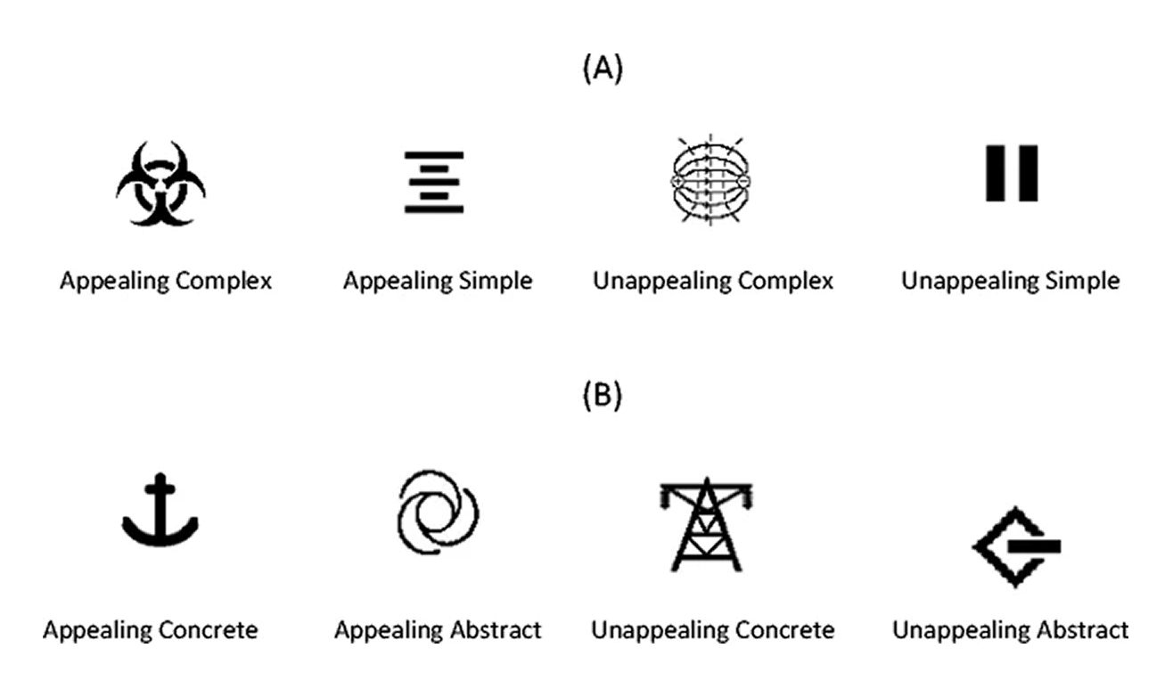
Aesthetic appeal also has a direct impact on user experience.
In their study When the Going
Gets Tough the
Beautiful Get Going: Aesthetic Appeal Facilitates Task Performance, Irene
Reppe and Siné McDougall found that visually appealing icons improve performance,
especially in complex, abstract, or unfamiliar situations.
The research shows that
familiarity has the strongest effect on aesthetic
preference. Icons that users have seen before are often rated as the most
attractive. Visual simplicity comes next,
with simpler icons generally perceived as
more appealing. Concreteness also influences aesthetic perception, but its effect
becomes secondary when familiarity is taken into account.
Another key finding is that aesthetically pleasing complex icons are noticed more
icons are noticed more
quickly than similar but less attractive ones. However, for icons that
are already
simple and easy to recognise, aesthetic appeal does not give any extra advantage in
recognition speed. This shows that aesthetic design plays a functional role,
especially in complex and dense interfaces.
In short, aesthetics is not just
decorative. It is a tool that
can enhance usability under challenging conditions.
4. Consistency Between Icons Builds Trust
When icons are used consistently across interfaces, users
learn more quickly what
they represent. For this reason, it is usually best not to break established
standards. However, consistency also means avoiding the use of multiple icons with
similar meanings within the same project. For example, using both a heart and a
star, which both suggest “like,” in the same interface can confuse users.
5. Design Icons That Support the User
Since there are no established icon standards for new technologies, it is essential
to verify through user testing that the icons are understood correctly. Icons should
be supported with text labels, tooltips, or short explanations, and designs should
be tested iteratively and refined over time.
The book also outlines 10 key
principles for
designing icons or creating an icon set. These principles provide a
practical framework for applying cultural context, aesthetics, and user experience
in design.
#
Principle 1
Adherence to Establish Conventions
If users are already familiar with an icon, use it. Familiar icons always give you
an advantage.
#
Principle 2
On Brand, But Not Branded
Icons should match your brand, but excessive styling should never compromise
recognition.
#
Principle 3
Simple Shapes
Simple icons help users understand the main idea faster.
#
Principle 4
Singular Ideas
Icons should not try to convey multiple complex ideas at once. Simple is usually
most effective.
#
Principle 5
Minimal Mapping
Represent a concept with as few visual elements as possible. Focus on making it
instantly understandable.
#
Principle 6
Persistent Meaning
Each icon should have a single meaning. Avoid using the same icon in different
contexts.
#
Principle 7
Consistent Representation
Avoid combinations of icons within the same interface that could create confusion.
#
Principle 8
Appropriate Metaphors
Icons can represent abstract ideas, but make sure they stay relevant to the context
and at the right level of abstraction.
#
Principle 9
Cohesive yet Distinct
An icon should make sense both on its own and alongside other icons in a set.
#
Principle 10
Selective Application
You don’t have to put icons everywhere. Use them only where they are truly needed.
My readings and research show that icons are quiet
but powerful parts of the user
experience. When we consider cultural context,
familiarity, aesthetics,
and consistency, icons are no longer just decoration. They become tools
that guide
users
quickly and effectively.
References
- Reppe, I., & McDougall, S. (2015).
When the going gets
tough the beautiful get going: Aesthetic appeal facilitates task
performance.
Psychonomic Bulletin & Review.
View
Article
- Wiggins, D. (2023).
The
Impact of Symbols and Icons on User Experience: Lessons from
Anthropology. Medium.
View
Article
- Kaplan, K. (2024).
Icon
Usability: When and How to Evaluate Digital Icons. NN/g Articles.
View
Article
- Kaplan, K. (2024). Digital
Icons That Work. [Book] NN/g.
- Dayananda, L. (2025).
The
Impact of Cultural Differences on User Interface Design Preferences.
ResearchGate.
View
Article
- Trigo E. (2025).
The
importance of iconography and symbolism in the digital world. DDigitals.
View
Article